Sins of Our Signs
Don’t blame your aging eyes: illegible typefaces, low contrast and tiny print are making many signs and labels difficult to read and understand
The GPS lady in our car dashboard was excited for us.
"You have arrived!" she trilled. "You have arrived!"
Had we, though?
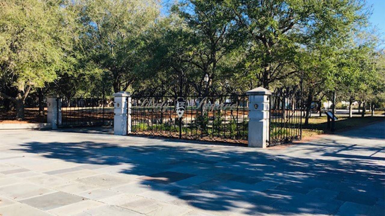
My husband and I were trying to find the entrance to the Fort Sumter and Fort Moultrie National Historical Park on the waterfront in Charleston, South Carolina.
Under the dappled shade of ancient trees lining the street, we squinted at the monochromatic landscaping. An elaborate iron fence seemed to delineate the perimeter of the park. But the script on the gate, as spidery as a fountain-penned Victorian signature, was illegible.
Are We There Yet? Who Knows?
Had we, in fact, arrived?
The map on my phone and the insistent GPS lady were confident that we were at the museum and entry point to the ferry that takes visitors to Fort Sumter, a tiny island in Charleston Harbor that was the site of the start of the Civil War.
We stowed our car in the clearly marked parking deck and, trusting the GPS more than our own eyes, headed toward the water we could see beyond the fence. Finally, the plain text of National Park Service signage came into view and we headed into the museum for an immersion in Civil War history.
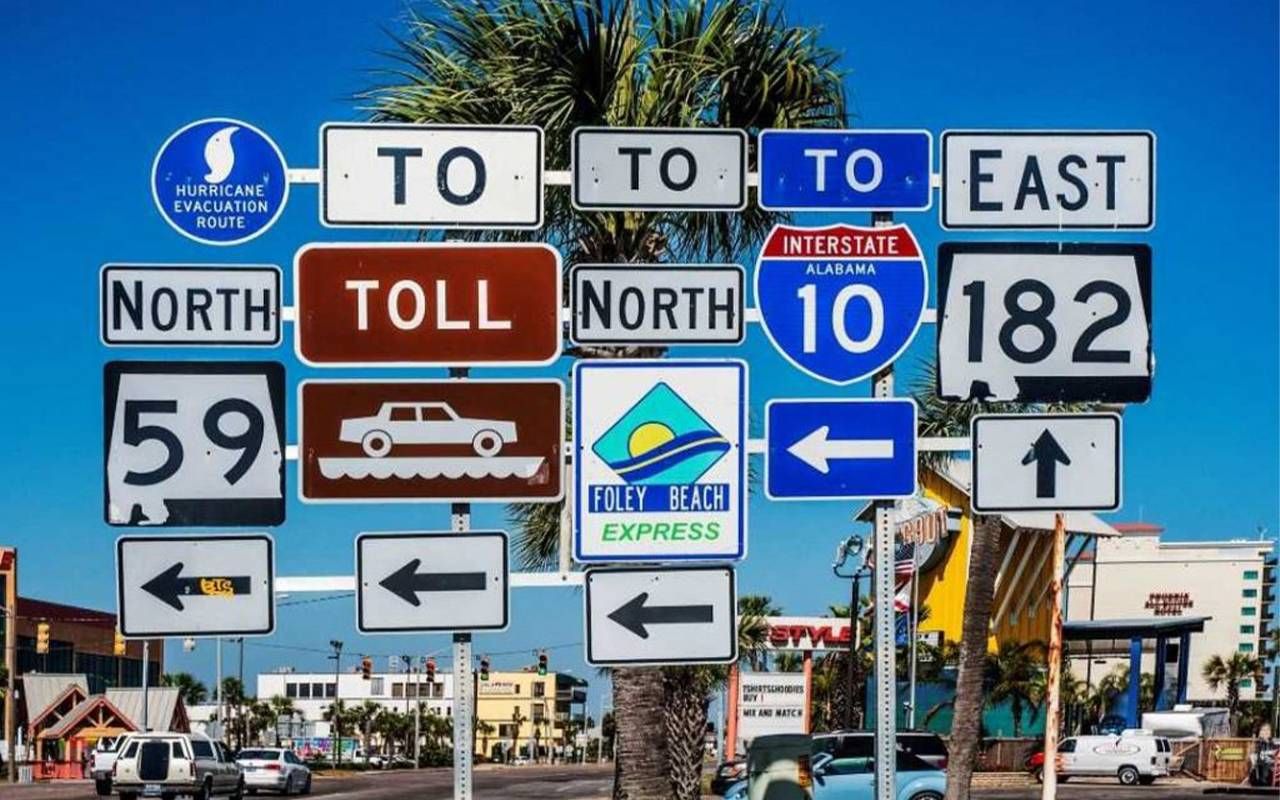
Illegible fonts, low contrast, tiny print and obstructed views are the four horsemen of the design apocalypse. That's not just me complaining: designers are constantly battling counterproductive sign and label design and placement.
"Nobody takes the time to consider, 'is this (sign) readable?'"
They're not winning.
"Nobody takes the time to consider, 'is this readable?'" says Michael Nova, director of Nova Custom Label Printing, and a 30-year veteran of the struggle to produce labels that the consuming public can read. "But others say, for the legalities, just put it on there, I don't care if it's legible or not. I only want my brand on there nice and big."
Digital design unencumbered by real-life test is much to blame, says Nova. The size of print and the contrast of print against the background color look very different on a backlit computer screen than they do on actual printed labels, bottles and packages in the real world. Designers sign off on digital proofs and only afterwards realize — maybe — that the final result is inscrutable, he says.
I didn't have to search for an example: one handily presented itself in the form of the 39° North brand of toiletries used by Marriott's Courtyard and Springhill Suites hotels, I learned at awkward moments in recent stays. The brand name is splayed in white reverse type on a gray-green background — low contrast but legible.
But which bottles are shampoo, conditioner and body wash? Unless you wear reading glasses in the shower, it'll be a mystery, because the three products are differentiated only by tiny green-on-green print at the bottom of the bottle.
Packaging design sins are annoying. The stakes are much higher for travelers who must make split-second decisions on the basis of confounding signs in airports.
Adam Bouchard is vice president of operations at the Tampa International Airport, generally recognized as one of the best for traveler navigation. A lot goes into minimizing stress for harried travelers, starting with the kinds of signs the airport won't use.
Tampa Shuns Scrolling Signs
Temporary signs — the kind that clutter the ever-under-construction American landscape — should always be distinctly different from the overall visual language of the airport's wayfinding signs, he says. Tampa doesn't have "signs with big letters that scroll," he says. "We don't do the whole 'hope your eyes can go fast enough to read this' thing."
"We don't do the whole 'hope your eyes can go fast enough to read this' thing."
Consistency in contrast, location and placement all add up to being able to read the right message at the right time for a swift and accurate decision, he explains. Contrary to my assumptions, the typical Tampa traveler is not a reflex-impaired older traveler but a young mom accompanied by small children, who inflict their own form of navigational impairment.
Bouchard says airport operations staff, like all design staff, often become so accustomed to reading their own designs that they don't realize how the public perceives the signs — or doesn't.
Jim Harding is director of environmental graphics with architecture firm Gresham Smith, that specializes in part in big public spaces populated by people who just want to get where they're going.
Put People in Control
The ability of the public to travel independently is a "top tier" goal, or should be, for managers of various ports and destinations, says Harding. "When you equip somebody with knowledge, they feel more in control of their journey," he says.
Some universally accepted figurative language, like the rounded silhouettes of men and women for their respective restrooms, have both eased those universal needs for information and elevated expectations for commandingly clear symbols and signs.
Harding adds that the value of signs varies by the goals and capabilities of each traveler. Signs that forecast the walk time between concourses are as helpful for people who need to make a pit stop or who have mobility issues.
Tips for Navigating Airports
Harding offers a couple of useful tips for cutting through the visual confusion: study an airport's maps (available online) in advance so you can gain a general sense of where you're going and milestones along the way and, when you're trudging through an airport, look up for structural clues.
Labels and signs shouldn't be an exercise in clairvoyance, but that's unlikely to change.
That's what I did when again wondering where I was in the Charlotte Douglas International Airport, my home airport and the subject of a major and endlessly tangled construction project. In each of my past five trips I've followed a mash-up of black-print signs pointing me here and there to baggage claim. (Black print differentiates presumably temporary signs from the airport's permanent signs, which are in bright aqua.)
On my most recent trip, in August, the fog finally cleared. I rounded yet another unfamiliar corner to see a sparkling glass elevator tower silhouetted against the blue sky beyond a new atrium. Where there's an elevator, there should be an escalator. Even though the crowd obscured waist-high signs, my intuition was spot-on — by design, says Harding, who consults with the airport.
Is That an Exit or Not?
My appreciation for the sudden clarity evaporated at the lower-level baggage claim. Searching for the right carousel, I encountered a fresh sign of confusion: in the boldest black on taxicab yellow, a sign with a left-pointing arrow and the scolding message: "Exit. No exit beyond this point."
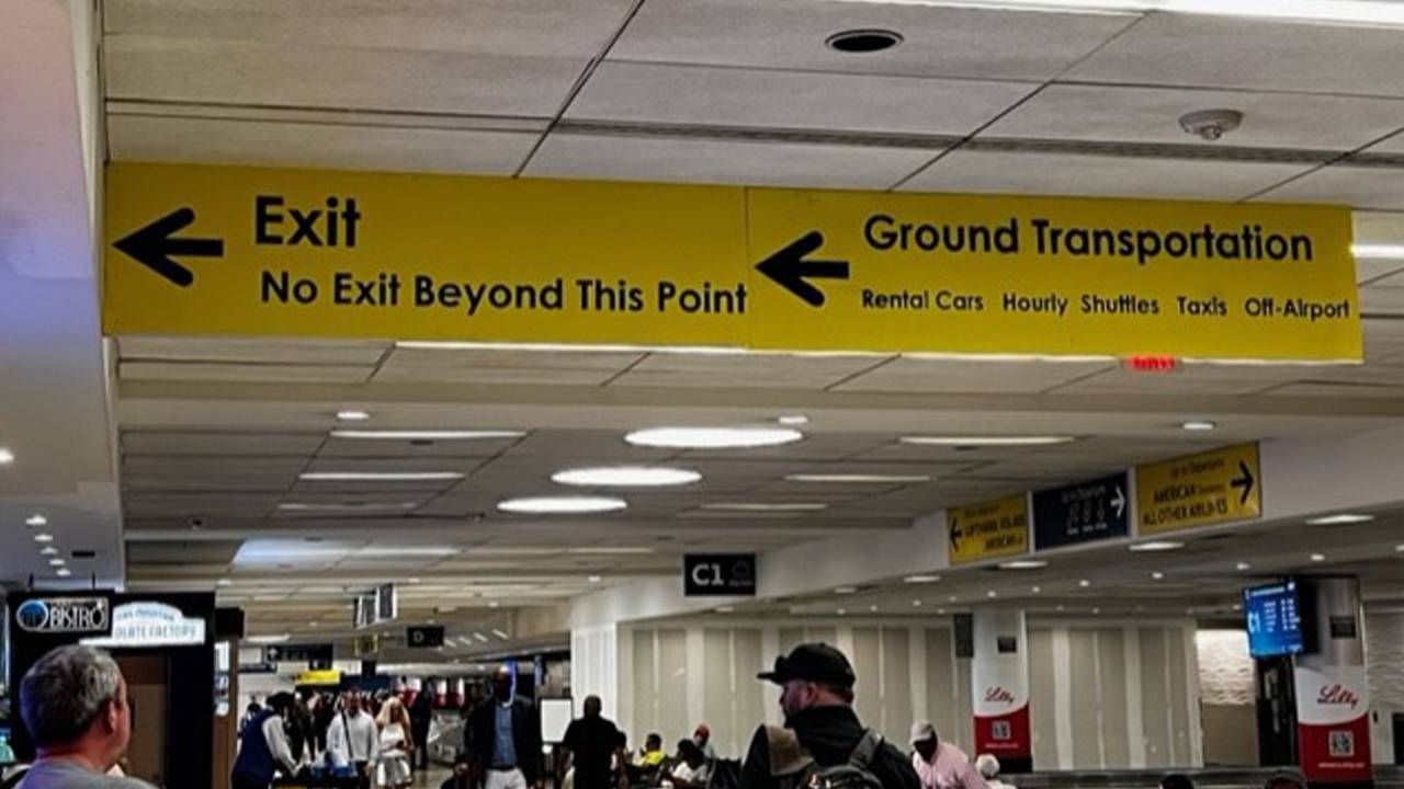
What's that again? I had no philosopher in tow to sort out this existential contradiction. Nor has the airport returned my calls seeking enlightenment on this riddle.
Labels and signs shouldn't be an exercise in clairvoyance, but that's unlikely to change. I asked the National Park Service about the too-fancy-to-be-helpful sign at Liberty Square, the street address in Charleston for the Fort Sumter and Fort Moultrie National Historical Park. Turns out it was never intended to be useful, but purely decorative, all along.
Other signs, said the official, peppered around the vicinity, are supposed to be the ones that visitors use. All the signs met the respective standards of their time, he explained in an email.
So to say, the ongoing sign of the times is that every sign makes sense at the time, until it doesn't, and then someone clears it up with another sign, which also makes sense at the time, until it doesn't. It's up to the rest of us to make sense of any of it any time.